Depth Vs Complexity In Game Design
Depth vs. Complexity in Game Design
![]()
Design Learnings from Game Design

One of the dominant discussions in the Destiny MMO community today is the imbalance of power across weapons. To summarize, there are 10 prominent weapons: 5 that are overpowered relative to other weapons, and 5 that are underpowered.
The overpowered weapons allow the player to "cheese," or play through a scenario in a way that the developers didn't intend, which ruins both the single- and multi-player and experiences. The underpowered weapons don't deal enough damage despite the difficulty to acquire them.
This leads to an im b alance of the game, where a small number of weapons are used by the majority of players.
To balance item power levels, the developer of an MMO will generally patch the game after it has already been released. There are generally two philosophies in game design to tweak item power levels:
- "buff" underpowered items
- "nerf" overpowered items
Both have pros and cons:
- If you buff underpowered items, you make players happy, because everyone loves to feel powerful in a game. However, buffing items inevitably creates new items that are underpowered, so this philosophy puts you on a path towards constant item buffing. Soon, you end up with every item being too overpowered, creating a quietly nefarious side effect called power creep.
In the case of Destiny, this is not a good result, because missions normally reserved for the end-game are no longer challenging, and competitive PvP turns into twitch-muscle-reaction gaming, with sub-half-second time to kill (TTK). - If you nerf overpowered items, you avoid the potential for power creep. However, you stand a good chance of making devoted players angry. This could be because they are emotionally attached to those items, or nerfing a rare item devalues the times that the player has already spent on getting the item.
This is particularly pronounced when you have a game based on RNG and loot like Destiny or World of Warcraft, or based on trading and virtual economy. In games with trading and economy, nerfing items with monetary value may create legal ramifications, and in some cases, players have even staged in-game protests.
If you're interested in how Bungie (Destiny's developer) is planning on rebalancing the game, read this post by Destiny's sandbox developer on the changes they are making.
Depth vs. Complexity
When balancing a game like Destiny, the developers are working to carefully manage the relationship between depth and complexity, defining a set of rules you have to learn to play the game. Weapon balancing is one set of these rules.
Depth is "the number of emergent, experientially different possibilities or meaningful choices that come out of one ruleset." Games with high depth are still strategically interesting and fun even after you have mastered the game's rules.
Complexity is how difficult it is for the player to understand the rules and their implications. If the game requires the player to track multiple rules at once, it makes it harder for the player to appreciate the depth of the game.
Some examples:
- Tic-Tac-Toe has low depth and low complexity. The rules are easy to learn, but there aren't that many possible strategies or outcomes.
- League of Legends has high depth and high complexity. There are currently 126 playable champions, each with their own sets of abilities, and their counters and relationships to each other. The map, however, has low complexity; it's always the same shape.
- Go or Chess have high depth and low complexity. The rules are easy to learn, but it takes a lifetime to master all the possible strategies, counters, and outcomes.
The conclusions as a designer are therefore:
- You want to create as much depth without too much complexity.
- Depth comes from complexity, but too much complexity also reduces depth.
- Elegance in design is therefore something that is high in depth to complexity ratio.
How is this related to general product design?
Rationing User Attention in UIs
Back to power creep, each of those weapons have their own characteristics and rulesets that hopefully entice the gamer to use it over another. But as those graphs show, less than 10% of the weapons dominate 90% of the usage.
The same applies to UI design. As you build more features for your product, each with their own rules and purpose, you add increasing complexity. This is where the "less is more" philosophy comes from. If you simply "buff" features to demand more attention, you'll soon end up with a complex UI that is impossible to understand.

Platform Permutations
As a UI gains more features and increases in complexity, how can you manage complexity while increasing depth?
The best platforms have incredible depth, but hide the features until you need them. Each specific type of customer can customize the product the way they see fit, with their own permutation of features or integrations.
Some examples of real companies that can do this:
Evernote
Document management is incredibly complex, and everyone uses documents. So Evernote is in the envious position of solving a problem for everyone, without introducing too much complexity into their UI.

For them, it's pretty clear to me that they've defined their core features: composing notes, sharing notes, and now messaging.
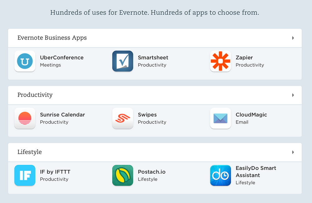
But I think they could do a better job packaging their app integrations. They organize their app integrations into "Collections", but I wish they were more specific about what type of customer or business I am. I'm not really sure what "Lifestyle" means, for example. I also wish they suggested apps for my use case in the onboarding experience.
E-Commerce Retailers

Potentially an unconventional example, e-commerce retailers face a similar challenge as app and game designers.
Instead of features, retailers have to deal with balancing a careful selection of items/SKUs. The more items you sell, the more difficult it is to manage the complexity of displaying the products to the customer in an intuitive way.
The current solution to this problem is also by creating "permutations" of products. More specifically, they are editorial collections of what the retailer thinks might be a relevant category the shopper is interested in.
Slack
If Evernote currently owns document management, Slack owns enterprise/team messaging. This wedge allows them to build out a separate type of experience, but they face the same challenge of building for specific archetypes.
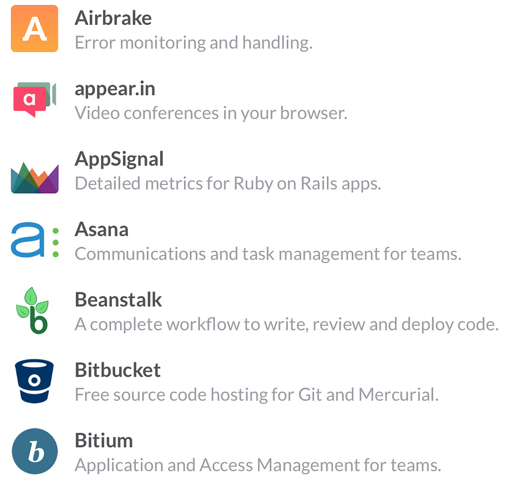
Slack has a large number of potential integrations, but currently it's displayed as a big list. I can see a world where Slack starts to suggest specific permutations of these integrations for specific use cases.

For example, the design agency would integrate Dropbox, Invision, and maybe Github. But the e-commerce retailer would integrate a CRM, ZenDesk, and Dropbox.
In these two separate archetypes, the irrelevant features and integrations are hidden from the user, to reduce unnecessary complexity while maximizing depth and specialization of the product to the user. In this way, a platform can be specific to a broad range of customer types.
Reducing Complexity in Onboarding
Finally, once you've defined the specific archetypes of customers you want to build specifically for, how do you show them in the easiest way possible what the optimal suggested setup is for them?
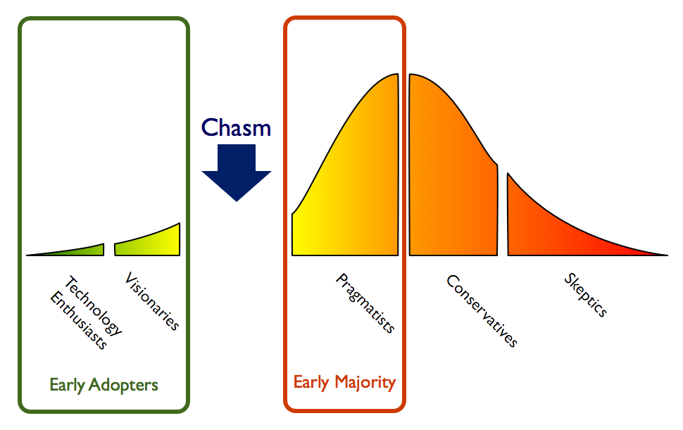
This is a question of onboarding and marketing. Most products let the user "opt-in" or proactively customize the product as they see fit. But the customers who intuitively understand this high level of complexity are rare, or incredibly patient. In the terms of Crossing the Chasm, these are your "visionaries." A complex product is hard to onboard.

I think the best platforms suggest what they think is a good "starter kit" for the customer, and automatically set up the product in a way that is customized at onboarding, a "mass custom" approach. I'll elaborate on this in a separate post.
Product Designers as Game Designers
As you can see, game developers face similar challenges to a product manager or designer in any field. And a product designer in many ways designs product similar to a game.
They build a product with a set of rules and complexities, and watch as the players interact with the product in ways that they intended as well as new ways that define new behaviors and sometimes exploit the system. This interplay between designer and user is what makes the most vibrant products thrive.
Depth vs. complexity is an interesting new framework any designer can borrow from the game designer's toolbox.
This article was cross-posted on my personal blog.
Depth Vs Complexity In Game Design
Source: https://medium.com/@wp/depth-vs-complexity-in-game-design-7e687d5f6f1f#:~:text=You%20want%20to%20create%20as,in%20depth%20to%20complexity%20ratio.
Posted by: maherhiscam.blogspot.com

0 Response to "Depth Vs Complexity In Game Design"
Post a Comment